Mobile First - Why Google Requires It in 2026
Learn why Mobile First is crucial for local businesses in Switzerland in 2026 and how to properly optimize your website.
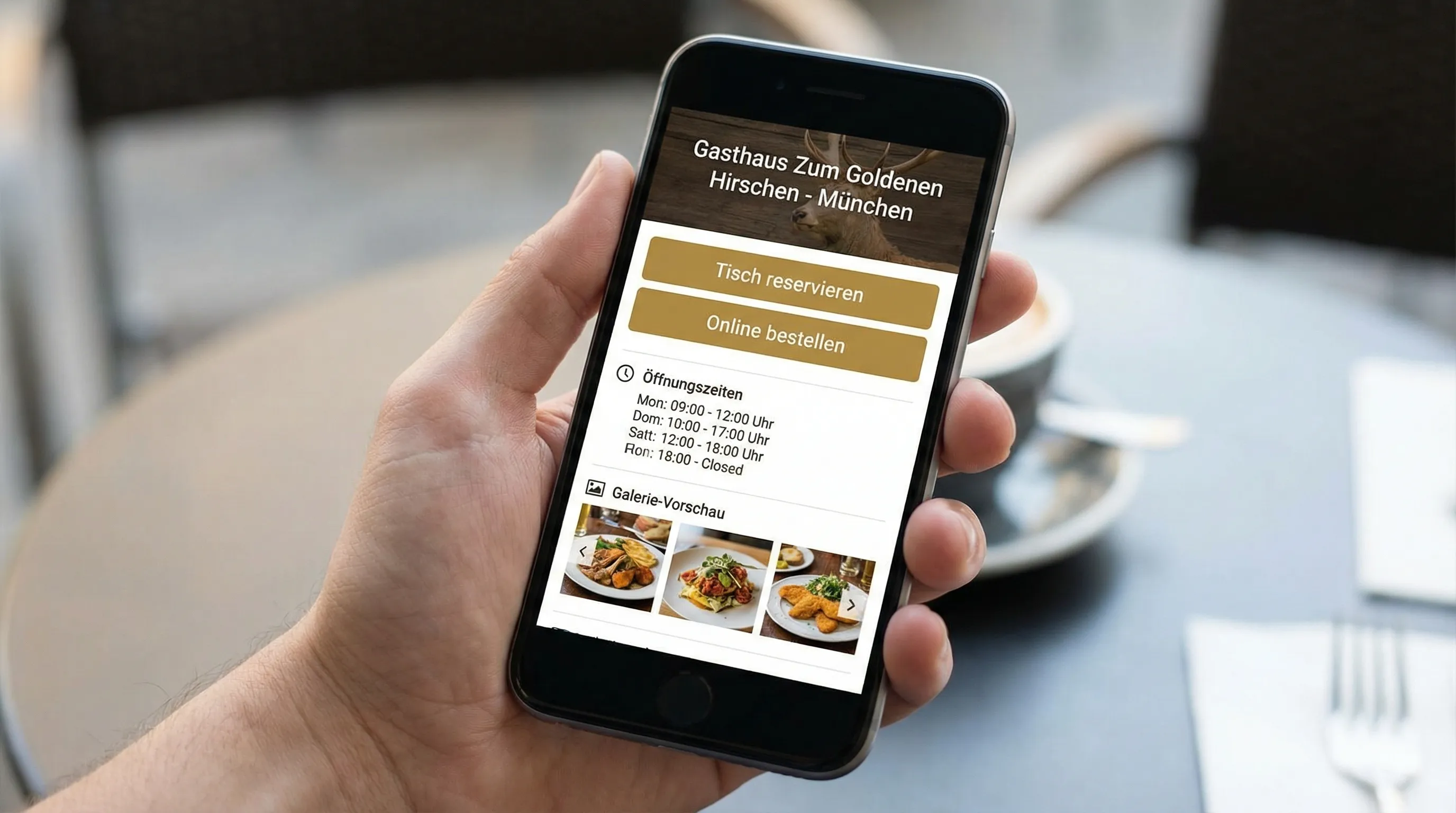
If you want to be found online in Switzerland in 2026, you need to convince on mobile. Not because “Mobile First” is a trend, but because Google and users expect it as the standard. For restaurants, cafes, and local service providers, this is particularly noticeable: The search happens on the go, the decision is made in seconds, and a slow or confusing mobile presence directly costs calls, reservations, and orders.
What “Mobile First” Practically Means in 2026
“Mobile First” today doesn’t just mean “the website is responsive.” It means that the mobile version of your site is in practice the most important benchmark, because:
- Google evaluates content and layout as displayed on smartphones (Mobile-First Indexing has been reality for years).
- User expectations are rising: fast loading time, clear buttons, immediately visible core info (hours, location, menu, contact).
- Performance and UX signals in search have stronger impact when your site feels “sluggish.”
Why Google Sets “Mobile” as the Standard
1) Googlebot Evaluates Your Site Like a Mobile User
In practice, this means: If content, internal links, or structured data are missing or different on mobile compared to desktop, this can affect your visibility. This is particularly common with:
- hidden or shortened texts on mobile devices
- mobile menus that “swallow” important links
- images that don’t load on mobile or are too large
2) Speed and User Experience Are Measurable (and Comparable)
Google has established clear metrics with Core Web Vitals that become especially relevant on mobile because mobile connections and devices vary more.
Current target values and definitions can be found at web.dev/Core Web Vitals.
3) Local Search Intent Is Almost Always Mobile
For many local searches: “I’m nearby and want to decide now.” Examples:
- “cafe near me”
- “restaurant zurich reservation”
- “pizza delivery winterthur”
When hours, location, menu, and a clear action (call, reserve, order) are visible first on mobile, the chance of conversion increases significantly.
The Most Important Mobile-First Signals You Should Master in 2026
Google doesn’t publish a “ranking checklist,” but the following factors are crucial in practice and well measurable.
| Area | What Google and Users Expect | Target / Benchmark (Best Practice) | How to Check |
|---|---|---|---|
| Load Time (LCP) | Main content appears quickly | LCP under 2.5s | PageSpeed Insights |
| Stability (CLS) | Layout doesn’t jump | CLS under 0.1 | PageSpeed Insights |
| Interactivity (INP) | Page responds immediately | INP under 200ms | PageSpeed Insights |
| Mobile UX | Buttons easily clickable, text readable | no “Mobile Usability” errors | Google Search Console |
| Content Parity | Content/meta/schema present on mobile | no shortened core info | manual, Search Console |
Note: These values are Google’s recommended thresholds (Core Web Vitals). Whether you hit every value exactly depends on setup and content, but they’re an excellent orientation framework.
Common Mobile-First Problems with Local Websites (and How to Avoid Them)
Images Too Large (Especially in Galleries and Menus)
Restaurants love photos, Google does too by the way, but not as 6 MB sliders. Typical countermeasures:
- Compress images and deliver in modern formats (e.g., WebP)
- Only load as large as the phone actually needs
- Use lazy loading for gallery sections
Unclear “Next Step” Action
Space is limited on mobile. If users have to scroll first to find phone number, reservation, or order, you lose them. What works:
- a clear button in the first screen (e.g., “Reserve,” “Order now,” “Call”)
- Click-to-call (phone number tappable)
- Hours and location immediately visible
Pop-ups or Banners That Cover Content
Especially on mobile devices, oversized newsletter pop-ups, cookie banners without clean design, or chat overlays are conversion killers. Make sure important content isn’t covered.
”Desktop Thinking” in Text and Typography
What looks elegant on a laptop is quickly too small or too cramped on mobile:
- sufficient font size
- clear line length
- enough spacing between clickable elements (tap targets)
Mobile First Specifically for Restaurants and Cafes: What Really Belongs on the Start View
For local food businesses, the mobile start view is often the actual sales counter. This content has proven effective:
- Name, cuisine/offering, location (immediately understandable, without scrolling)
- Hours (today) and note for deviations (holidays)
- 1 main action: Reservation or online ordering (depending on business model)
- Phone and directions/Maps as secondary actions
- Menu quickly accessible (not as huge PDF, if possible)
A common mistake is overloading the mobile start view with “branding” instead of making the decision easier.
One-Page and Mobile First: Do They Go Together?
Yes, when the one-page site is built for mobile, not for desktop. Especially for small local businesses, a one-page website has advantages:
- short paths: all important info in a clear sequence
- faster launch and simple maintenance
- strong conversion focus (one page, one goal)
What’s important is the structure. A good Mobile-First one-page has:
- clear section order (offering, hours, menu, images, reviews/trust, location, contact)
- lean navigation (e.g., anchor links)
- fast media (compressed images, no unnecessary effects)
How to Check Your Mobile-First Quality in 30 Minutes
PageSpeed Insights: Performance and Core Web Vitals
Use PageSpeed Insights and check the mobile evaluation. Pay special attention to:
- “Largest Contentful Paint” (LCP)
- “Interaction to Next Paint” (INP)
- “Cumulative Layout Shift” (CLS)
Google Search Console: Mobile Usability and Indexing
In Google Search Console you’ll find information about:
- mobile usability issues
- crawling and indexing errors
- Core Web Vitals (depending on property and data availability)
Reality Check: 5-Minute Test with Real Tasks
Open your site on mobile and try without thinking:
- find the hours within 5 seconds
- reserve or call within 10 seconds
- open location/directions
If this doesn’t work smoothly, that’s a stronger signal than any theory.
Mobile First Is Also a Trust Signal in 2026
Many users judge credibility through details that are particularly noticeable on mobile:
- SSL (https)
- no layout errors
- no cut-off texts
- immediate clarity: What do you offer, where are you, how do I reach you?
Especially with local businesses, trust often develops before someone even reads the reviews.
Frequently Asked Questions (FAQ)
What is Mobile First at Google?
Mobile First means that Google evaluates the website as it’s crawled and used on mobile devices. The mobile version is thus decisive for visibility and user experience.
Is “responsive design” enough for Mobile First?
Responsive design is the foundation, but not automatically enough. Mobile First also includes performance, clickable elements, content parity, and clear mobile user guidance.
Which Core Web Vitals are most important in 2026?
The most important metrics are LCP (main content load time), CLS (layout stability), and INP (responsiveness). Google provides target values and details on web.dev.
Why is Mobile First especially important for restaurants and cafes?
Because the search often happens on the go and users want to act quickly. If reservation, order, hours, and location aren’t immediately accessible on mobile, inquiries are lost.
Can a one-page website be good for Mobile SEO?
Yes, if it loads fast, is clearly structured, and the most important content is accessible on mobile without detours. A one-page site can be very conversion-strong for local businesses.
Mobile-First Website in Days Instead of Months
If you want a fast, mobile-friendly, and SEO-optimized one-page website for your restaurant, cafe, or local business in Switzerland, Web Alpine Studio can help. The sites are designed for short loading times, mobile usage, and clear actions (e.g., online ordering or online booking).
Learn more at webalpinestudio.ch.